Bridging Stakeholder Interests
March 15, 2026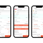
Optimizing Voucher Conversion
March 15, 2026Tasks
Project management, Research, UX, UI, User-testing, Developer hand-over
Tools
Figma, After Effects, Miro
The Mission
Redesign the account creation flow for a Brazilian Investment Brokerage to eliminate drop-offs and modernize the "web-view" mobile experience.
The Core Challenge
90% of users were on mobile, yet they were forced through a non-responsive web form. This led to a 70% abandonment rate on the very first page.
Result
Delivered a high-fidelity, native mobile-first onboarding system that streamlined document submission and reduced cognitive load through step-by-step navigation.
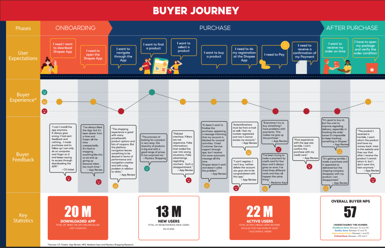
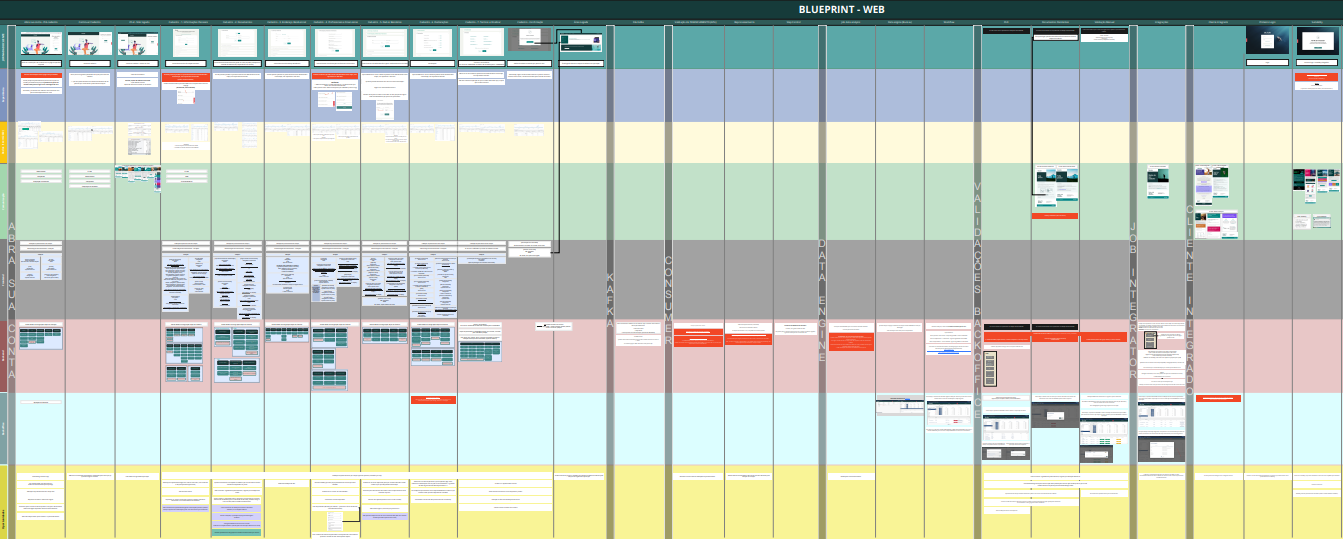
Strategic Discovery: The Service Blueprint
To identify the root causes of account abandonment, I developed a Service Blueprint that mapped the entire ecosystem. By aligning data from Google Analytics, Hotjar, and Customer Support, I visualized:
-
Front-End Pain Points: Where users struggled with non-responsive inputs.
-
Back-End Friction: Where manual document analysis delayed the "Time-to-Value."
-
Drop-off Data: Confirmed that 30% of users abandoned the flow at the "Bank Information" step due to confusing form layouts.
The Problem: "The Web-View Trap"
-
The Reality: 90% of the audience was mobile, but the product was 100% web-focused.
-
The Friction: Users were required to send physical documents via email, a major break in the digital journey that led to a complete loss of conversion.
-
Competitive Insight: Top fintech players use OCR (Optical Character Recognition) and Face Recognition for real-time validation—standardizing security and speed.
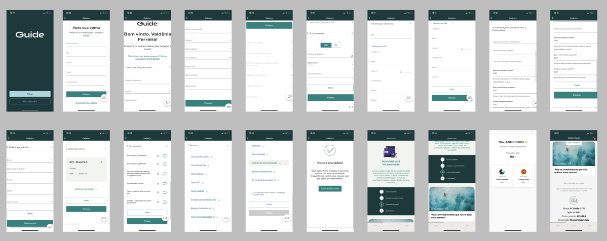
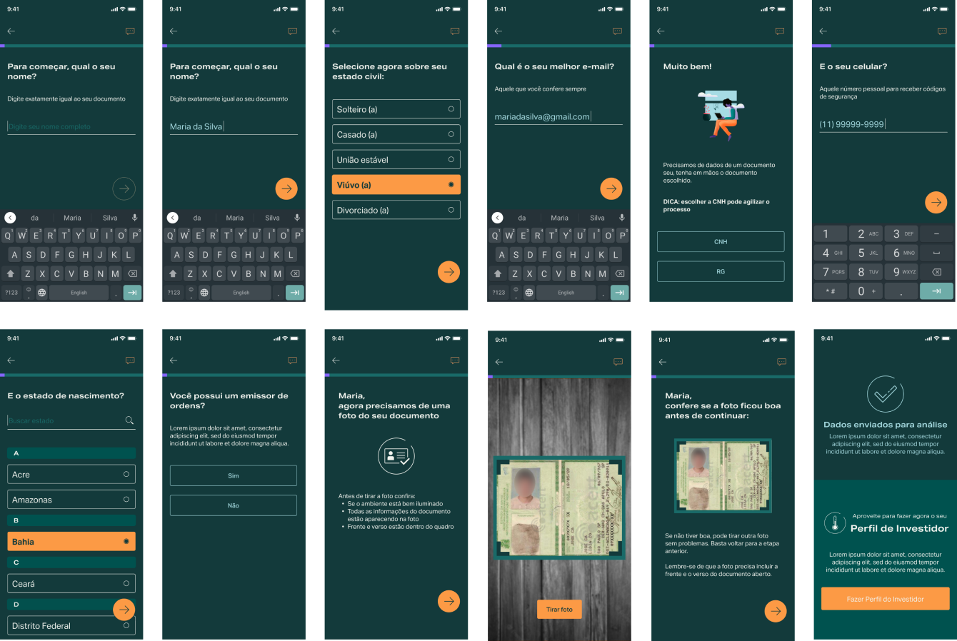
The Solution: Mobile-First Architecture
-
Native UI Components: Replaced the "big form" with a native mobile framework, using a custom timeline/progress bar to manage user expectations.
-
The "One-at-a-Time" Flow: Reduced cognitive load by asking for only one piece of information per screen, preventing "form fatigue."
-
Brand Integration: Infused the company’s "Green" brand identity into the UI to build trust and security—crucial for a financial brokerage.
-
Agile Iteration: Used "Design Critiques" with fellow UX designers to pressure-test the flow before moving to high-fidelity prototyping.
Validation & Metrics
Measuring Impact within Constraints Due to a high-velocity project timeline, I conducted internal benchmarking to validate the new native architecture. I focused on comparing the legacy web-view performance against our new mobile-first prototypes. By tracking task completion speed and identifying the friction points that previously led to a 70% drop-off rate, I was able to confirm that the new "one-at-a-time" flow significantly improved user confidence and data accuracy before the final developer handover.
| Blueprint Layer | Focus Area | Key Discovery |
|---|---|---|
| Customer Journey | The visual steps the user takes within the mobile app. | Identified that 70% of users dropped off at the very first screen. |
| Behavioral Data | Google Analytics, Hotjar, and App Store reviews. | Confirmed a 30% abandonment rate during the 'Bank Information' step. |
| Technical Stack | Front-end and Back-end validations and limitations. | Discovered that the "Web-View" limited responsiveness and caused input errors. |
| Internal Process | Manual work required by the Customer Support team. | Found that requesting documents via email was a major bottleneck for conversion. |
Impact & Reflection
-
The Win: I successfully transitioned a legacy web-based process into a modern, native mobile experience. By mapping the journey via a Blueprint, I identified the "Web-View Trap" that was responsible for the 70% first-page drop-off, providing a clear roadmap for the mobile-first redesign.
-
Business Value: This project established a secure, scalable onboarding foundation. By moving document submission into the native flow, we eliminated the "email bottleneck," significantly reducing manual overhead for the Customer Support team and shortening the "Time-to-Value" for new investors.
-
Personal Growth & Future Validation: This project reinforced the power of the Service Blueprint as a alignment tool in fast-paced environments. While the initial validation was internal due to timeline constraints, my post-launch plan includes:
-
Funnel Analytics: Monitoring the "Bank Information" step to ensure the previous 30% drop-off has stabilized.
-
Drop-off Correlation: Tracking if the move from web-view to native leads to a higher percentage of completed document uploads.
-
Feedback Loops: Using in-app surveys to catch any "real-world" friction that internal testing may have missed, ensuring the onboarding remains a living, evolving gateway for the business.
-