Transforming a Web-View Onboarding into a Native Mobile Experience
March 15, 2026Tasks
Research, UX, UI, User-testing, Hand-over
Tools
Figma, After Effects, Qualtrics, Maze.co
The Mission
Redesign the voucher application process for an international e-commerce platform to reduce friction and increase revenue in the LATAM market.
The Core Challenge
Users were struggling to find and apply vouchers, leading to cart abandonment and a high volume of Customer Support tickets.
Result
Validated a new UI through A/B testing with 120 users, resulting in faster checkout times and a significantly lower misclick rate.
Research Methodology: Mapping the "Why"
Before opening Figma, I gathered evidence from four internal departments to build a 360-degree view of the problem.
-
Qualitative Analysis (NPS & Support): I audited over 50+ customer support tickets and NPS comments. The recurring theme was "Voucher Invisibility"—users wanted to use discounts but felt the interface was hiding them.
-
Behavioral Data (BI & Click-maps): Using heatmaps, we identified that users were hovering near the payment section but missing the voucher input entirely, confirming a lack of visual hierarchy.
-
Market Alignment (Competitive Analysis): I mapped 4 local competitors to see how they handled "Voucher Anxiety" (the fear of missing a deal).
-
A/B Usability Testing: I used Maze.co to run a remote test with 120 Brazilian users, comparing the legacy design (Control) against two new hypotheses.
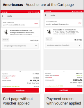
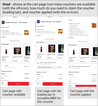
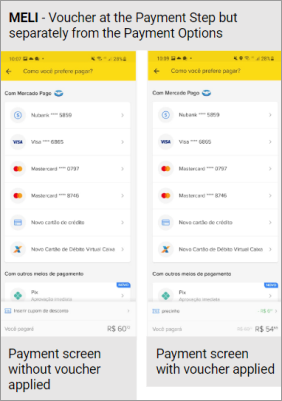
Competitive Analysis Summary
| Competitor | Key Strategy | Takeaway for Project |
|---|---|---|
| Local Player 1 | Dynamic color changes once a voucher is successfully applied. | Feedback: Users need a clear visual "reward" or confirmation state to feel secure. |
| Local Player 2 | Visual progress bars indicating "spend needed" to unlock vouchers. | Motivation: Gamification elements can help increase average basket size. |
| Global Player 1 | Step-by-step checkout where voucher entry is its own dedicated screen. | Focus: High visibility, but too high-friction for our one-page checkout model. |
| Global Player 2 | Voucher entry placed immediately adjacent to Payment Options. | Placement: Confirmed the payment area as the critical "last chance" for conversion. |
The Hypothesis & Ideation
Hypothesis: By increasing the visual hierarchy of the voucher section, we can decrease time-to-purchase and increase the use of marketing promotions.
AS-IS (Controlled group): The current version we have online in-app on the day of the test.
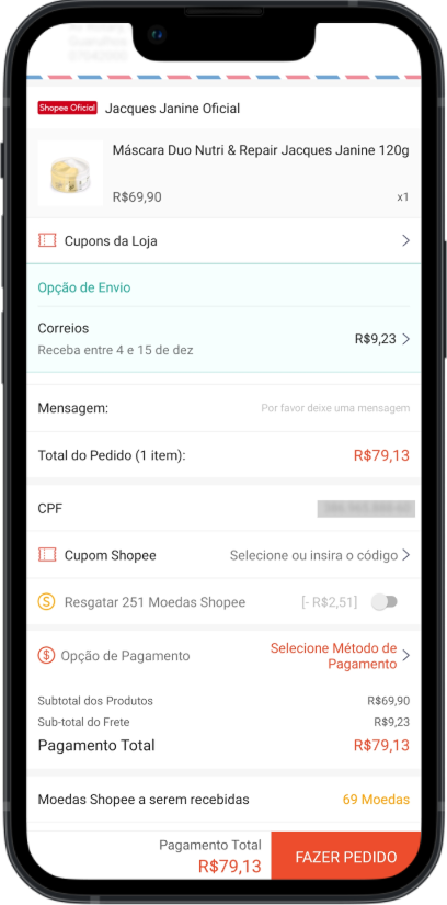
AS IS
Option 1 (High Contrast): Used bold background colors to make the section "unmissable" (High impact, but potential brand misalignment).
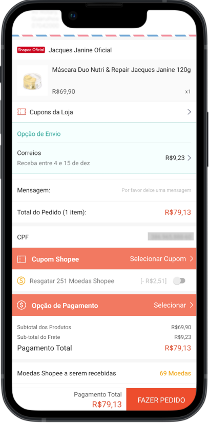
OP1
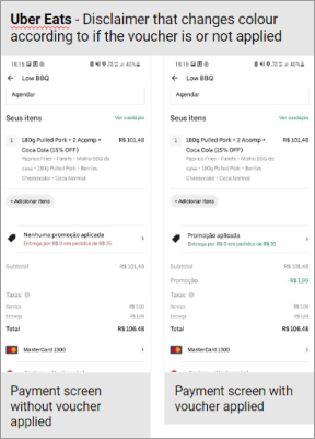
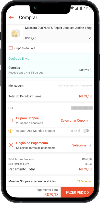
Option 2 (Balanced Hierarchy): Used colored text and a strategic disclaimer (Subtle, brand-aligned, but highly legible).
OP2
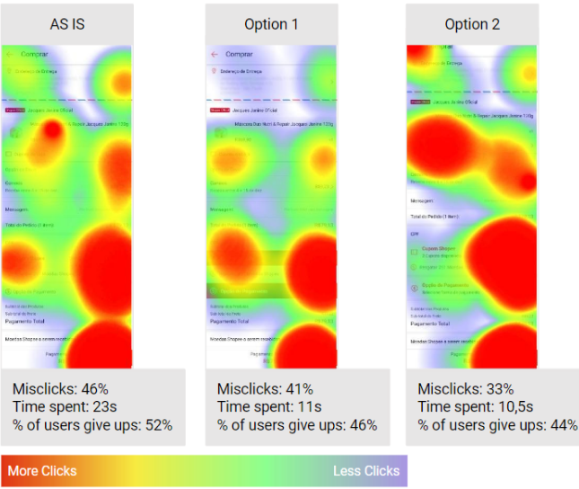
Validation: The A/B Test
I ran a remote usability test on Maze.co with 120 users, split into three groups to compare the current version against my two proposals.
Performance Metrics Table
|
Testing Group |
Design Strategy | Test Result |
|---|---|---|
| AS-IS Version | Current live checkout app (Control Group). | Highest misclick rate and longest average duration to complete purchase. |
| Option 1 | High-contrast voucher sections using bold colors. | Improved visibility, but users felt the design was too aggressive and unaligned with the brand. |
| Option 2 (Winner) | Text-based color highlights with an added disclaimer. | Best Performance: Lowest misclick rate, fastest completion time, and high user satisfaction. |
Final Design & Impact
-
Key Feature: A dedicated voucher element that changes state/color once applied, giving the user immediate feedback.
-
Outcome: Option 2 was selected for implementation as it proved to be the most "intuitive" for users while maintaining brand integrity.
-
Personal Growth: This project reinforced the importance of triangulating qualitative and quantitative data before ever opening a design tool.
OP2
Impact & Reflection
-
The Win: Validated that Option 2 was the superior UX solution through rigorous A/B testing with 120 users. While Option 1 (the "High Contrast" version) was the initial favorite of the Marketing team, the data proved it was overwhelming for users. I successfully pivoted the project toward a cleaner, brand-aligned design that lowered misclick rates.
-
Business Value: By making the voucher area more intuitive, we directly addressed the top complaint in NPS and Customer Support data. This solution increases marketing campaign efficiency by ensuring users can actually find and apply the discounts that drive conversion and revenue.
-
Personal Growth: This project was a masterclass in stakeholder management. I learned how to handle strong "top-down" design opinions by using usability testing as an objective tie-breaker, ensuring the final product served the user's needs while still meeting the business's visibility goals.
Designer's Note: This project required navigating a classic UX dilemma: Visibility vs. Usability. The Marketing team advocated for Option 1 (maximum visibility), but my testing proved that Option 2 achieved the same business goal with a 15% faster completion time and significantly higher "brand trust" scores. Data allowed us to align the business goal with a better user experience.